How motifs and designs have evolved over time
In 1976, a success story began at Karl Knauer that remains an integral part of the company today: inspired by a customer, the first gift packaging was created. With the “Kellertrunk” design, the foundation was laid for a business segment that, over five decades, has grown into a strong brand and achieved market leadership in Germany.
But it is not only the product range that has expanded. The evolution of gift packaging design is particularly fascinating, as it reflects social trends, changing consumer habits and new brand requirements.
“Our gift packaging is far more than a protective cover. It is an expression of appreciation – and it was already so 50 years ago,” says Stefanie Wieckenberg, Managing Partner of Karl Knauer. “What has changed is the way in which we translate this appreciation into design.”
Let us take a look at the design journey over the past 50 years.

The 1970s & 1980s: Functionality meets classic elegance
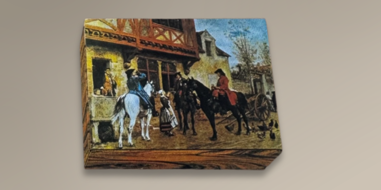
In the early years, the focus was primarily on function and perceived quality. Gift packaging was intended to present products – particularly wine and spirits – in a premium way while ensuring safe transport.
Typical characteristics of this period included:
- Serif typefaces with a traditional feel
- Ornamental elements and heraldic motifs
- A strong connection to tradition and continuity
- Imagery centred around craftsmanship and indulgence
The design conveyed reliability, seriousness and craftsmanship. Above all, gift packaging was representative.
The 1990s: Brand awareness and individualisation gain momentum
With increasing competition and a stronger focus on branding, requirements began to change. Companies sought to differentiate themselves – including through their packaging.
Key developments during this phase:
- Custom logo embossing
- Hot foil stamping
- Colour schemes aligned with corporate identity
- Clearer, more reduced layouts
- A shift towards graphic patterns instead of traditional ornamentation
- Classic colours such as dark green and dark blue
Packaging evolved from a functional product into a strategic marketing tool.
“In the 1990s, there was a clear shift in perspective,” says Wieckenberg. “Gift packaging was no longer merely an accompaniment to the product, but an active brand ambassador.”
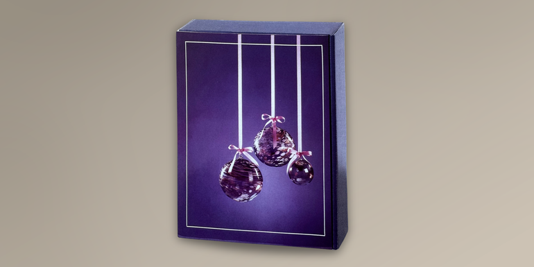
The 2000s: Emotionalisation and experiential value
From the 2000s onwards, emotional appeal moved to the forefront. Packaging was expected to tell stories, highlight occasions and create purchasing impulses at the point of sale.
Design trends of this era:
- Themed worlds (Christmas, anniversaries, birthdays, moments of enjoyment)
- Pictorial motifs and illustrations
- Tactile effects through embossing and textured surfaces
- Combinations of matt and gloss finishes
Gift packaging increasingly became an experience when giving and unwrapping.
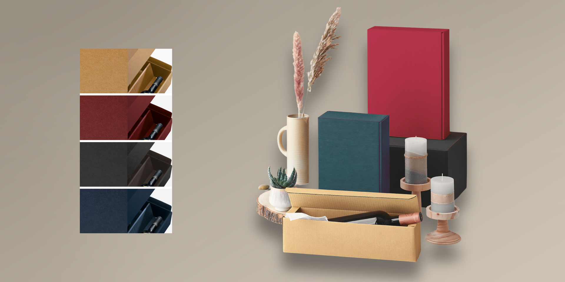
Struktura VITA has been part of the range since 2009 and has become a true classic. The packaging impresses with its elegant, textured surface. Particularly practical: thanks to the matching outer carton, Struktura VITA can be shipped with ease – a high-quality solution for those who value both appearance and functionality.
The 2010s: Minimalism, naturalness and sustainability
As society shifted towards more conscious consumption, design thinking also evolved.
Key developments:
- Reduced, clean design
- Natural tones, kraft paper looks and muted colours
- Less “decoration”, more substance
- Authentic, handwritten-style typography
- Sustainability messages visibly integrated into the design
Packaging was expected not only to look premium, but also to convey values.
Since 2018, the PURE line has complemented the range, combining a natural tactile feel with clean lines. And to ensure gifts arrive safely, PURE line is easily shippable thanks to a matching outer carton – a stylish solution for those who appreciate understated aesthetics.
“We clearly see that design today must communicate values,” explains Key Account Manager Lara Armbruster. “Sustainability, authenticity and quality are now more important than pure decoration.”
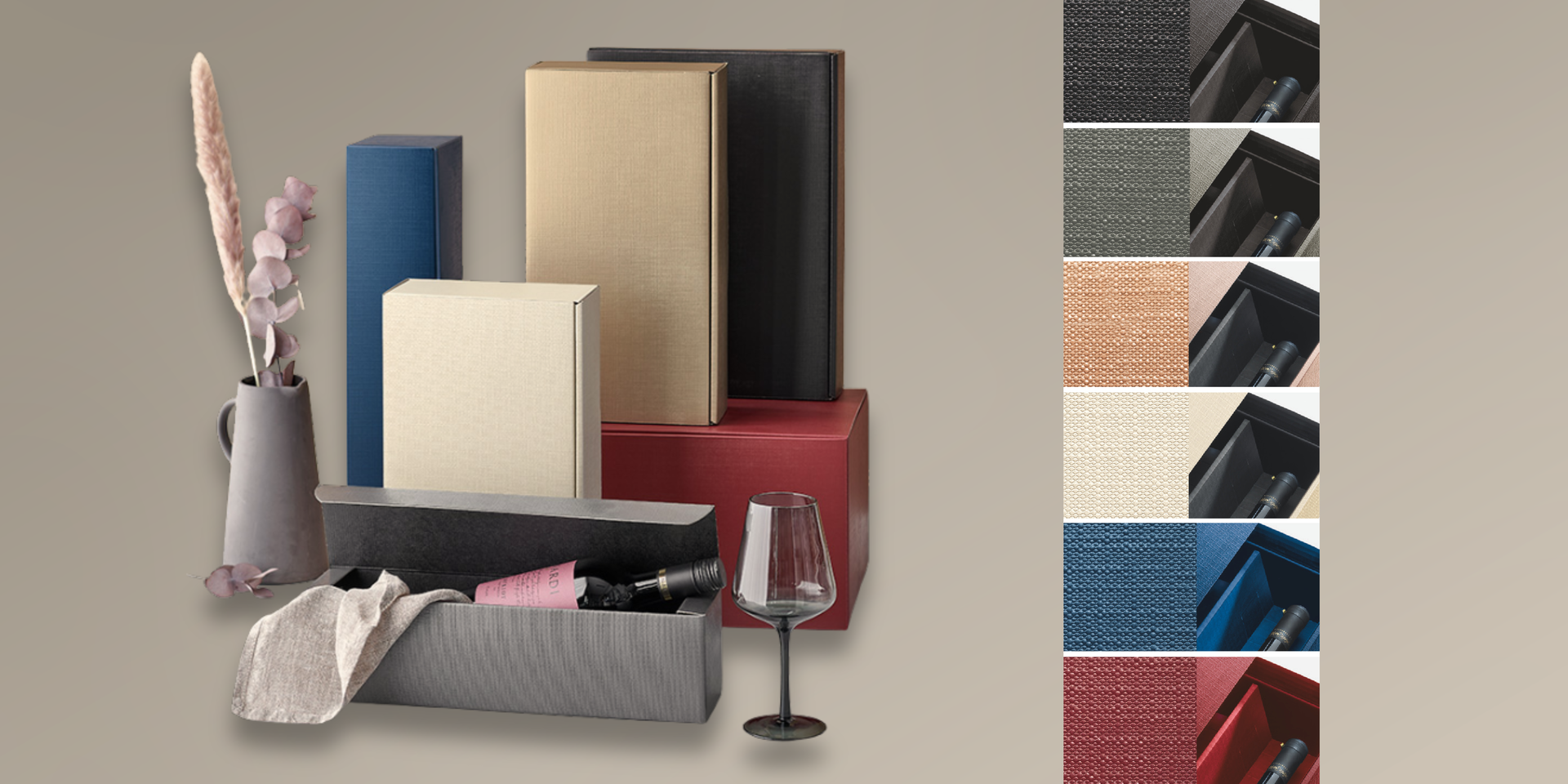
The 2020s: Premiumisation and personalisation
Today, gift packaging operates in the space between sustainability, premium expectations and digital visibility.
Current design features:
- Bold colour schemes or deliberately understated elegance
- High-quality finishes used as accents rather than across entire surfaces
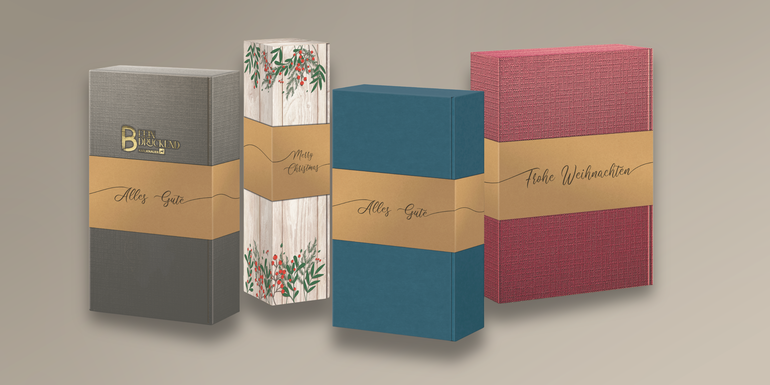
- Personalisation options, for example through bands or sleeves
- A combination of analogue experience and digital storytelling
Packaging becomes a stage for the product – and often a part of the gift itself.
50 years of development – and no end in sight
From classic ornamentation to brand-driven design and minimalist, value-oriented aesthetics, the motifs and design concepts of gift packaging have continuously evolved – always in line with social trends and customer requirements.
“What has defined us since 1976 is our closeness to the market,” emphasises Wieckenberg. “We listen, observe trends and continue to evolve – without forgetting our roots. That is what makes 50 years of gift packaging so special to me.”
Today, gift packaging at Karl Knauer is:
- A brand ambassador
- A carrier of emotion
- A driver of sales
- An expression of appreciation
And it demonstrates impressively how design not only reflects trends – but also writes history.