Clarity as a concept
Packaging and product in harmony
Minimalism as a design principle
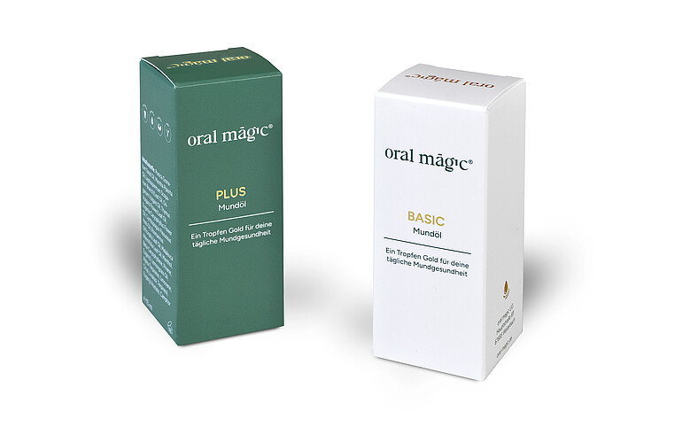
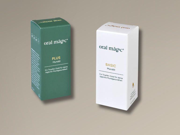
The oral oils “oral magic basic” and “oral magic plus” from the start-up oral magic were developed over several years by dentist Dr Katharina Klein in her dental practice and are aimed at users with a focus on natural care. Accordingly, the requirements for the packaging for the first official market launch were clearly defined: a reduced design that provides information without overwhelming, while conveying a high-quality appearance at the same time. The packaging design and brand development were created by the agency Digitallotsen and formed the basis for the implementation by Karl Knauer.
“Our product stands for quality and naturalness. That is exactly what the packaging should reflect – calm, clear and high-quality, without distracting from the product itself,” explains Dr Katharina Klein, dentist and founder of oral magic. “Together, we have found a solution that meets this ambition.”
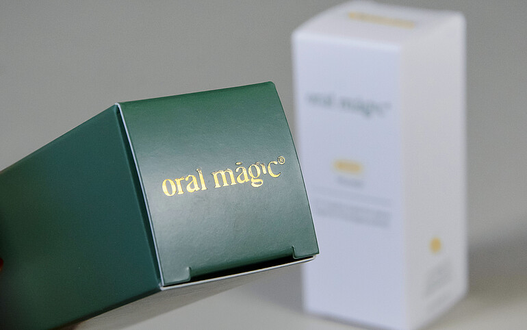
Precise finishing for a premium effect
At the core of the implementation is a reduced folding box with a clean layout and a focused information hierarchy. A consistent colour scheme forms the basis of the design. A defined spot colour is used in both variants, but with different emphasis: once applied as a solid background, and once exclusively within the typography. This creates a clear differentiation whilst ensuring strong brand recognition. Precise hot foil stamping adds subtle accents and enhances the packaging with tactile refinement and perceived value. The overall appearance underlines the product’s commitment to quality without distracting from it.
Collaboration on equal footing
For the start-up, close support throughout the entire process played a central role. From the initial stages through to final implementation, Karl Knauer provided provided expert guidance across design, technical, and production-related areas.
“The collaboration was uncomplicated, fast, and highly professional from the very beginning. Especially in the early stages, it is incredibly valuable to have a partner who not only executes but also thinks along and provides advice,” says Dr Katharina Klein.
“Our aim is to support our customers in a hands-on way – beyond pure production,” adds Lara Armbruster, Key Account Manager at Karl Knauer. “We contribute our experience at an early stage to jointly develop solutions that are both visually appealing and functionally convincing.”
Packaging as a brand element
The folding box thus becomes a visible element of brand development – particularly during the initial market entry. It conveys values such as quality, clarity and reliability, thereby becoming an central element of product communication.
The project highlights Karl Knauer’s role as a partner for high-quality packaging solutions, supporting companies from the very beginning and providing comprehensive advisory services throughout the process.